

Client
MediFill (Entrepreneurial Venture)
Scope
January 2013 - December 2014
Role
UX/UI Design, Research, Prototyping, User Testing
Deliverables
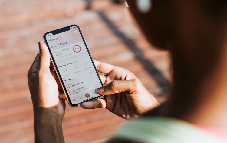
End-to-end Mobile App
Team
Strategic Designer, UX & Visual Designer
OVERVIEW
Background
32 million Americans use three or more medicines daily and 75% of adults don’t take medications as prescribed. There is a $300 million economic impact due to poor medication adherence that costs the U.S. healthcare system each year.
Design Problem
Medication users and pill bottle owners do not have any manageable adherence solutions for items that are always a part of their wellbeing. Research supports that people will value products that would address their need in adhering to their treatment regimens and improve their medical conditions.
Goals
We had conducted several research methods to gather critical information from users and understand the areas that could enhance the dosage medication identification tool.
Identify the demographics of dosage medication identification tool
Determine users’ expectations when managing medication regimens
Discover current market trends and competitors key strengths and weaknesses
Discover what concerns, assumptions, needs, and wants may exist
Understand users’ experience with current pillbox capabilities
Research Questions
We formulated questions that would allow us to gain the best insights into the conducted research to support the needs of medication users and empower them in understanding their medication regimen. We needed to ensure a focus on users who were familiar with dosage medication identification tools.
Medication adherence tracking tools:
What are the capabilities of current available medication tracking tools and how do they add value to the lives of medication users?
Better understanding of adherence cycles:
How do medication users perceive their own adherence cycles and how much awareness do they have about their own regimens?
Navigating challenges around medication adherence:
What are the strategies used to prepare for challenges faced during different stages of the adherence cycle and shift users mental model?
PRIMARY RESEARCH
We identified competitors’ strengths and weaknesses through competitive analysis and current trends with market research.
Market Positioning
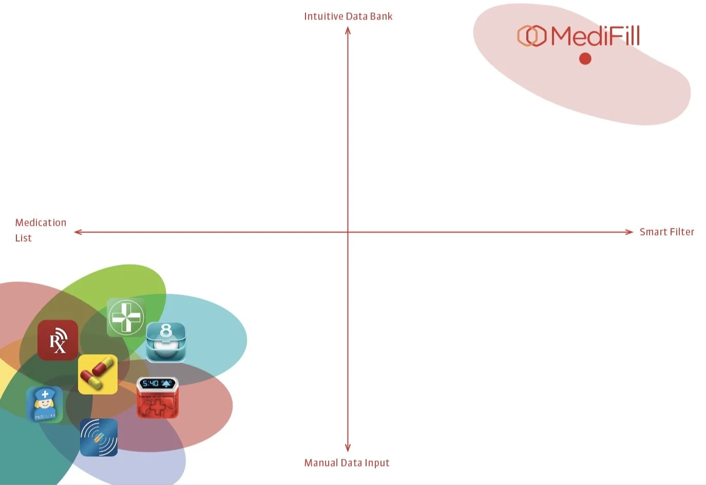
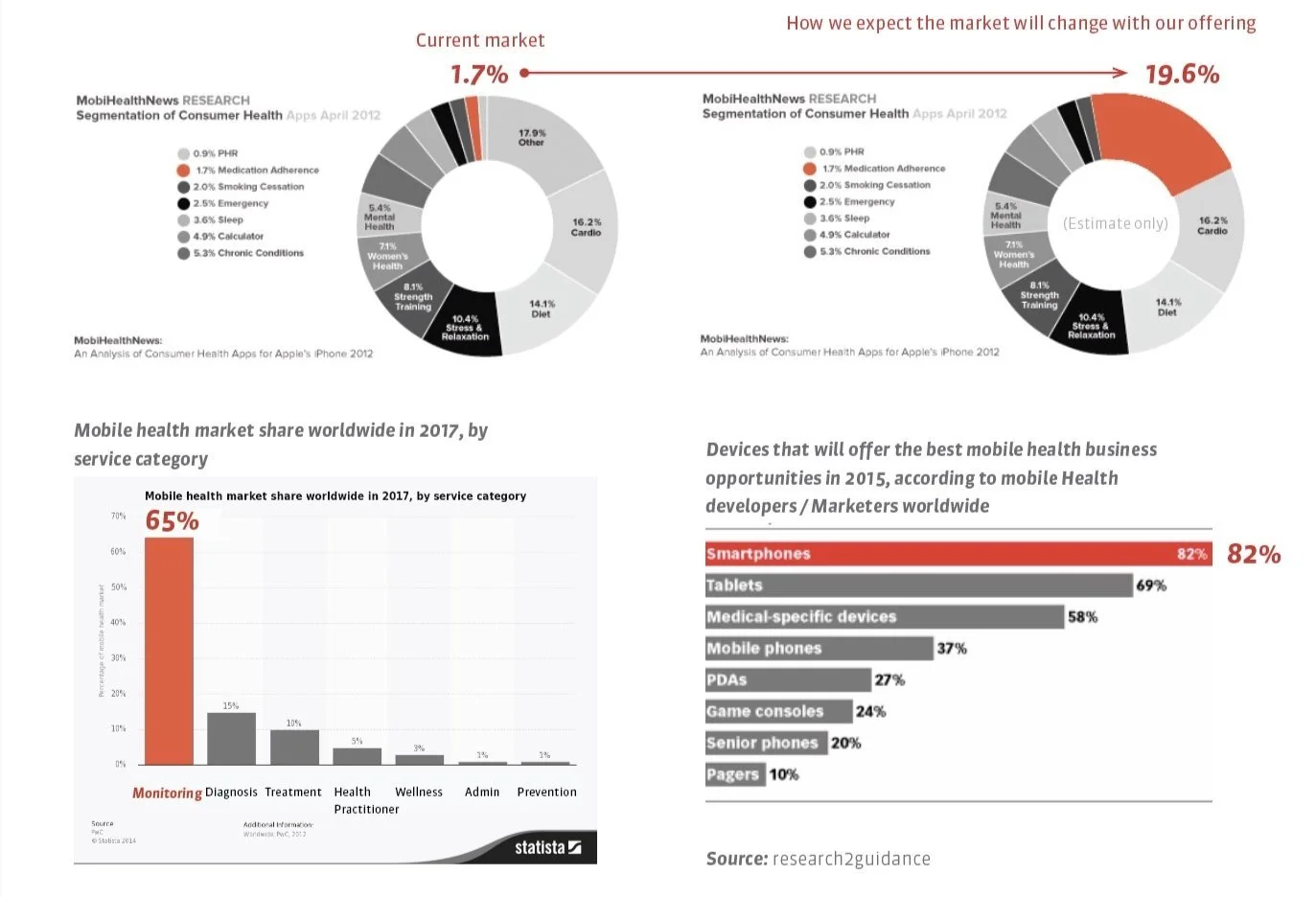
Market Trends & Analysis
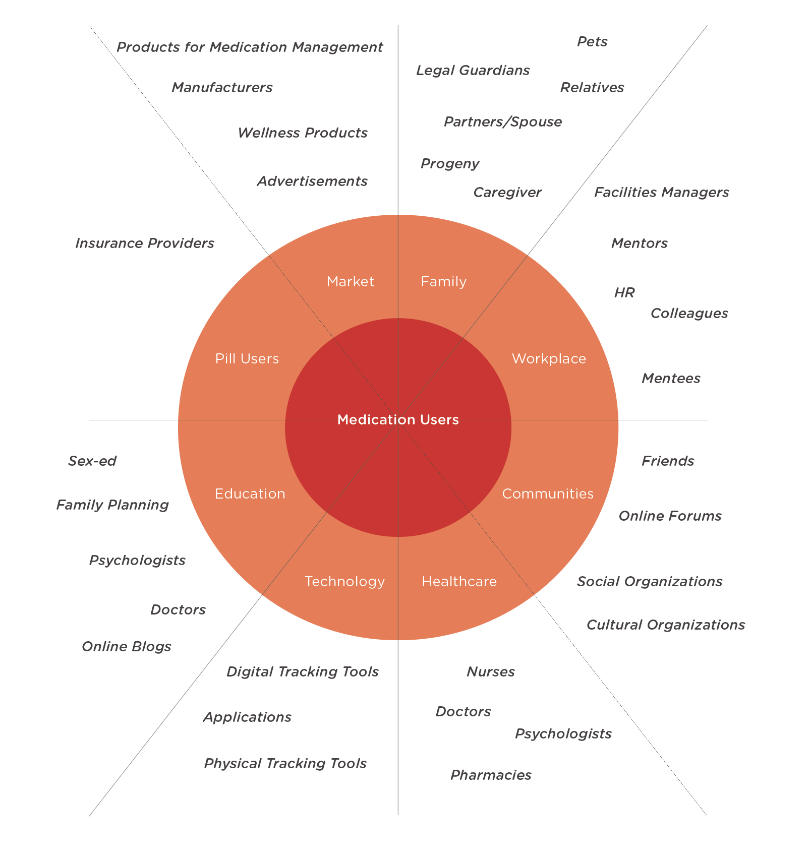
Stakeholder Mapping
STEEP Analysis


Demographic
SECONDARY RESEARCH
To answer the research questions, a survey was administered targeting a specific demographic in mind: users familiar with pillboxes, especially those who highly understood dosage medication identification tools, helped us know the answer to the above questions and understand user motivations.
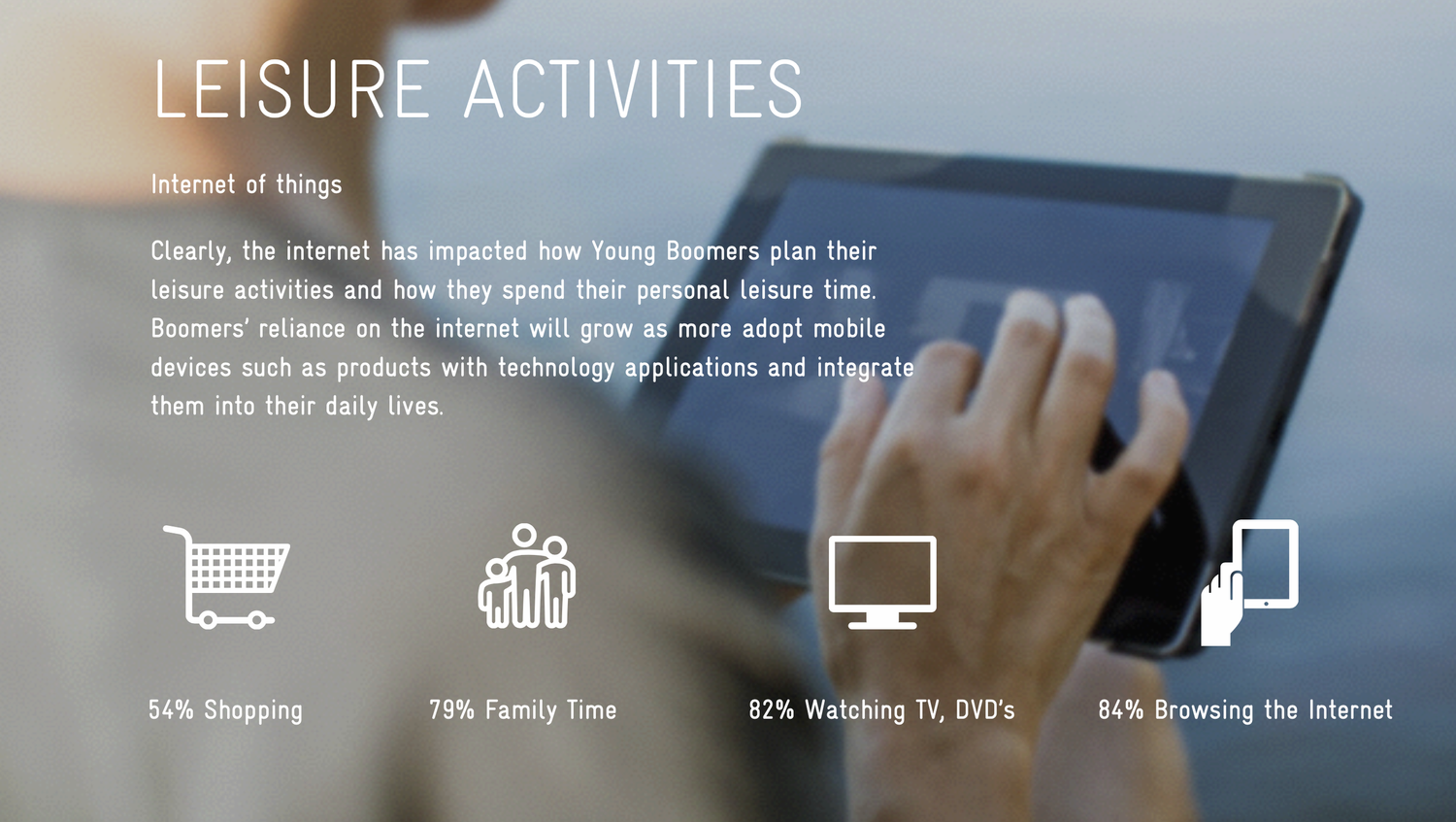
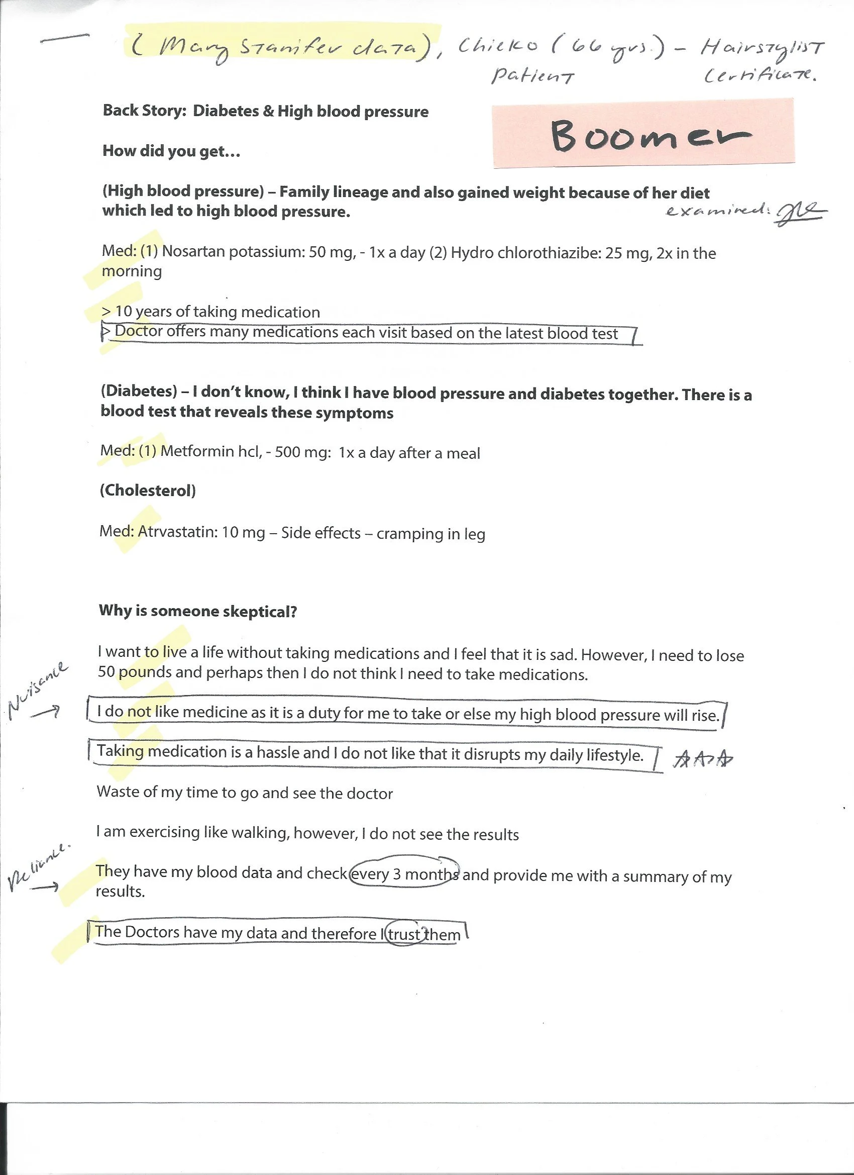
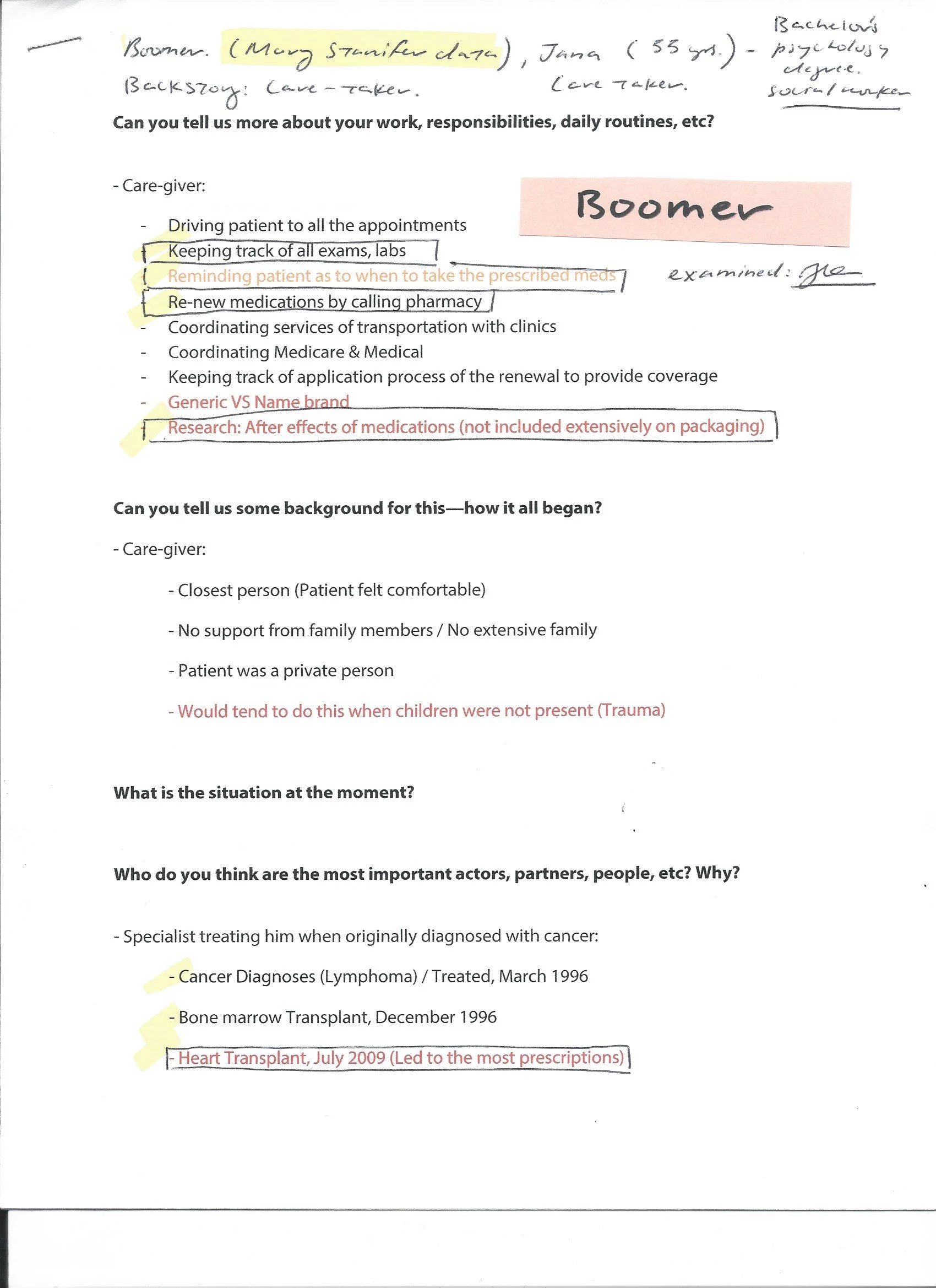
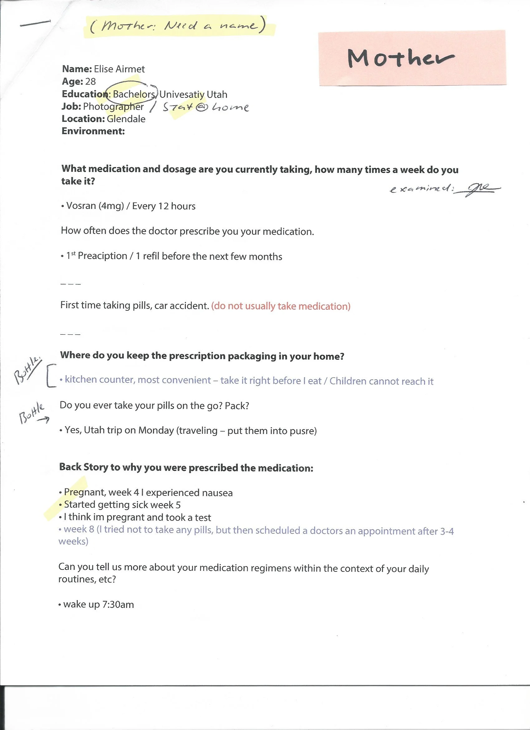
A total of 5 participants, ages 45-54, were surveyed, all with a complex medication background. Boomers comprised of 75% of the main demographic, and the remaining 25% as Gen X. Participants were all experienced app users and had intermediate knowledge in managing a manual pillbox.
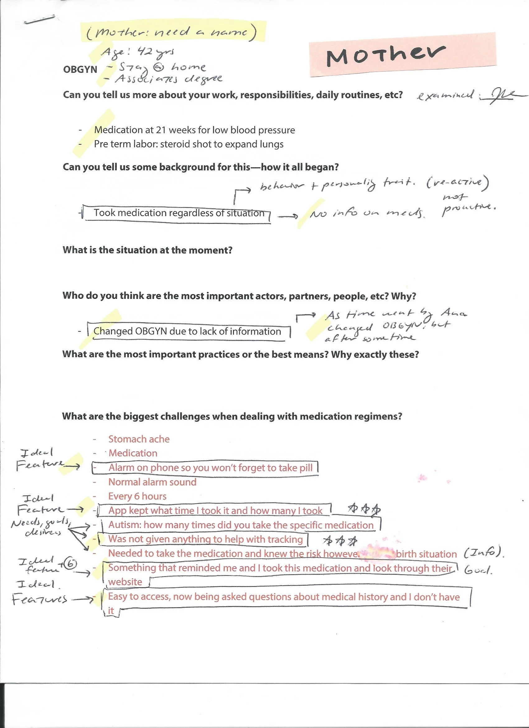
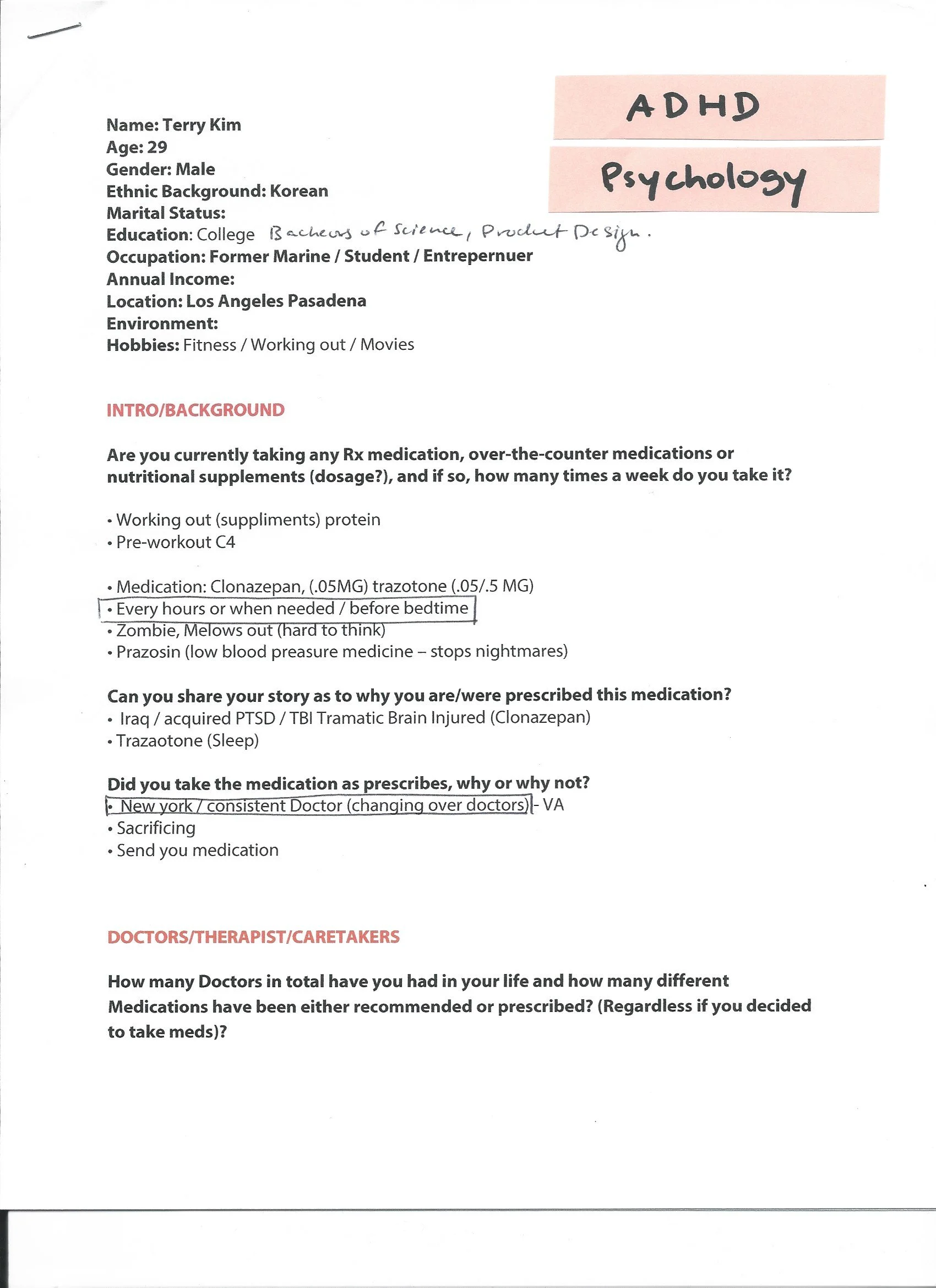
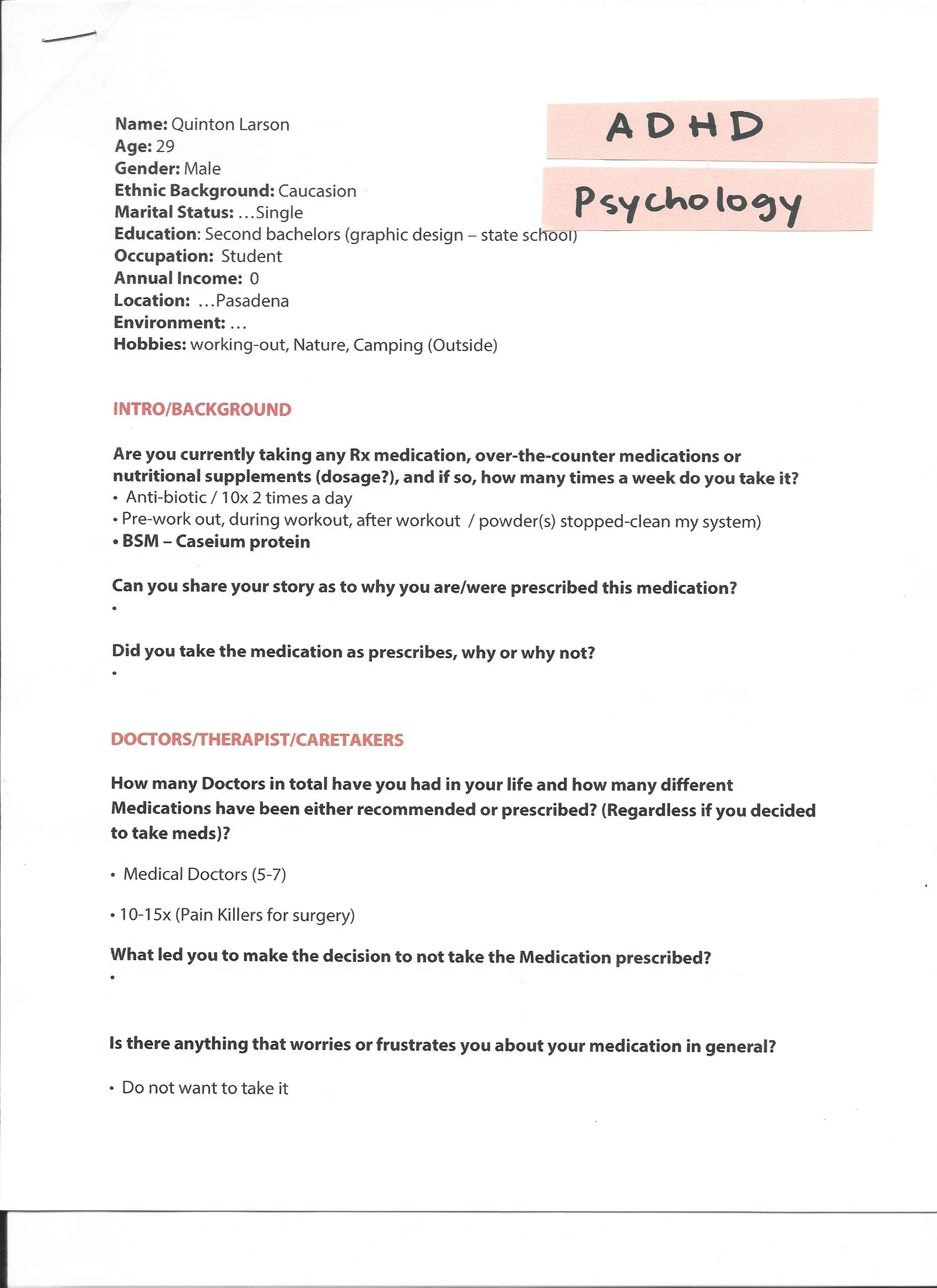
User Interviews
With the intention of delivering quantified experience design, the interviews were designed to have a discussion on the relevance of existing medication adherence services available to the demographic we interviewed. Through this conversation, we uncovered their values and beliefs towards several existing offerings. Their motivations to purchase pill boxes and manage their medication regimen in their health was highlighted.
Through these interviews and observational research, we wanted to learn more about the medication users:
Awareness about one’s own adherence cycle
Methods of medication adherence tracking
Perceived value of medication adherence tracking
Impact of adherence cycles on social and professional lives
Strategies to navigate adherence
Planning daily activities around medication adherence
Interview Guide
We structured the interview discussions to gain a deeper understanding.
Getting to know the medication users
Acquaintance with digital health applications
Outlook on medication adherence
Priority and attitude towards self service medication adherence
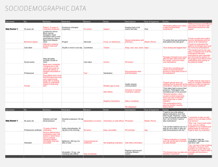
The research covered a target demographic of several age segments and gender based on the customer discovery done by the Strategic Designer and the current users of key market competitors in the digital health space.
Interview Findings
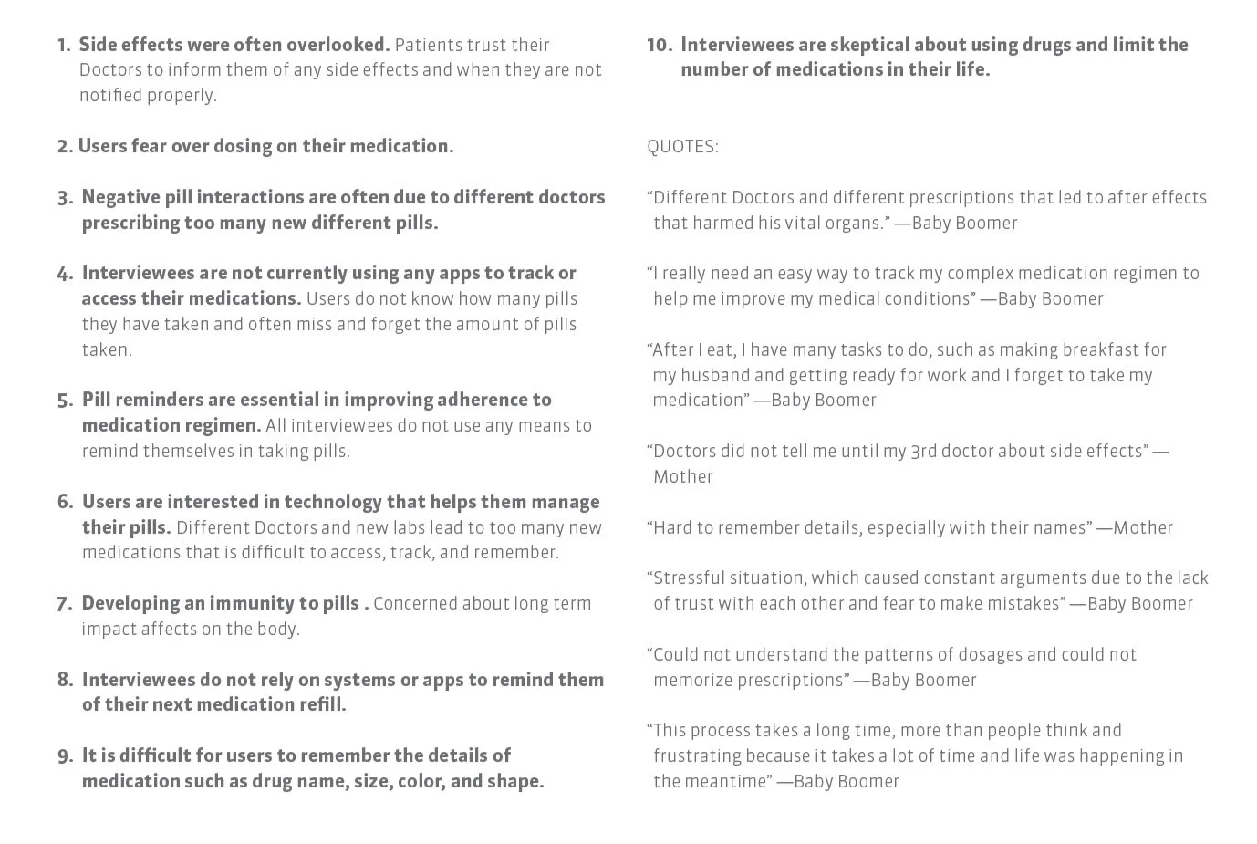
Key Insights
We were able to generate insights which led to the development the design principles.
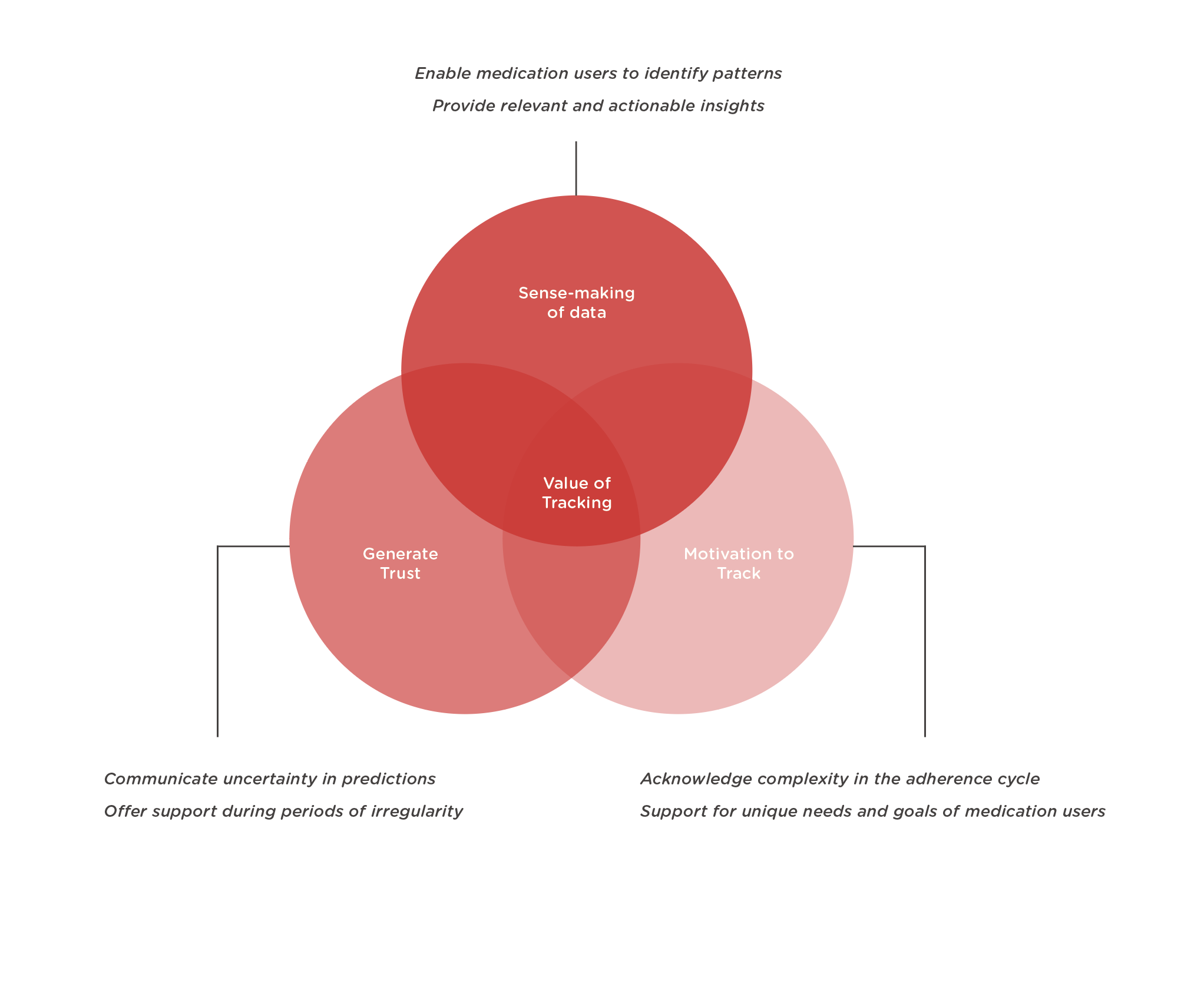
1. Contextual and meaningful insights require regular tracking:
Patterns in the adherence cycle become evident only when there’s enough data about the cycle. Without sufficient data, insights seem irrelevant.
2. Regular tracking requires motivation:
Even if it takes less than a minute to track, most medication users don’t feel motivated to do it because the trackers fail to communicate the value of tracking. The complicated UX of most apps poses challenges in generating motivation.
3. What do I do with all this information?
Most trackers fail to convert insights into actionable tasks that can improve adherence cycles.
4. Tracking is valuable when there are irregularities in the cycle:
Medication users seek methods of sense-making when they don’t understand what’s happening in their cycles.
5. Predictions are inaccurate because behavior does not work like a clock:
Behavior is a complex system that can’t be simplified using algorithms to predict medication regimens accurately.
6. Communicating uncertainty in predictions can increase trust:
Most trackers predict the next adherence cycle as if it were true. When this doesn’t happen, it leads to lack of trust. If trackers communicated that their predictions are inaccurate by acknowledging the uncertainty it can lead to increase in trust.
7. Every medication users experience is complex and unique:
Trackers convert complex behavior into simplified statistics that don’t effectively describe the lived experiences of medication users.
DEFINE
Design Principles
The key insights led to a clear understanding of the value of medication tracking and how it can be enhanced. The value of tracking can be improved by focusing on 3 main categories:
POV Statement & HMW Questions
A problem statement, or Point of View, was created to better understand the specific users, their needs, and most essential insights about them.
“MediFill users need a way to improve the adherence process because the existing tracking tools still present certain limitations.”
By framing and opening up the POV, we were able to brainstorm HMW questions that the user might come up with. They allow for a variety of solutions and generate several possible answers. How might we…
improve the adherence process
explore better options
remove unnecessary features
make the tracking process more efficient
User Persona
After synthesizing interview data we created key user personas to help identify the target audience for the feature development and how this would add value to someone who regularly uses medication tracking tools.


IDEATE
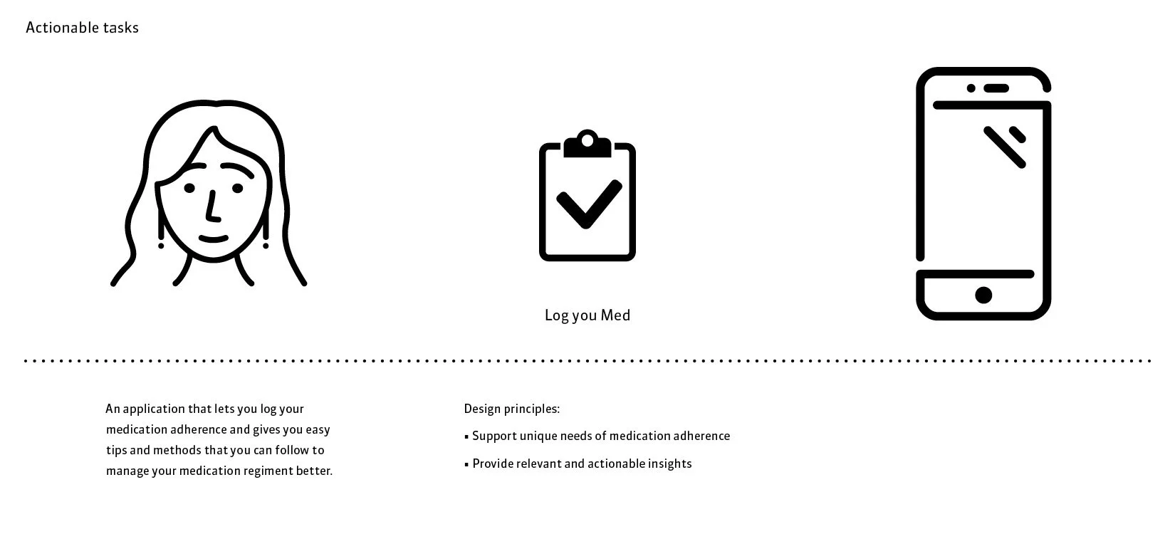
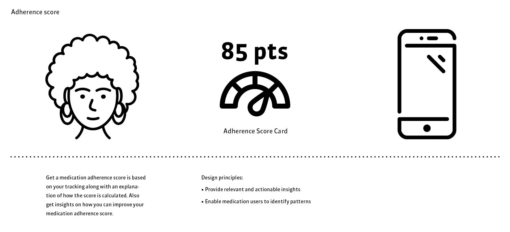
Concept Storyboards What-If-Scenarios
Once we (1) understood the As-is experience, (2) identified how the experience can be improved for users, and (3) familiarized ourselves with strategic priorities at large, we started mapping out what a To-be experience could look like.
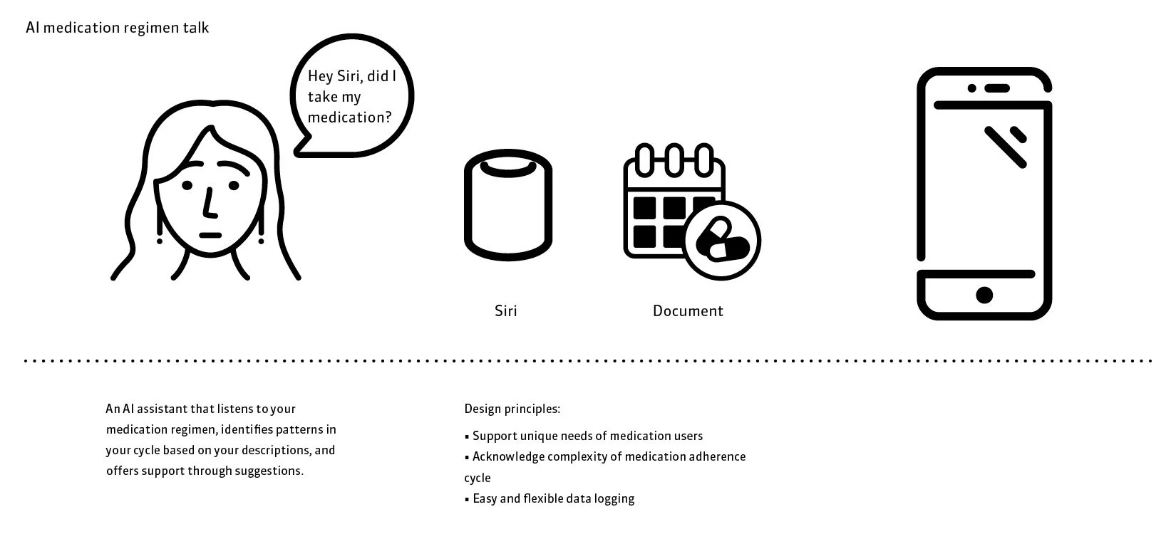
The goal was to use the three emerging design principles to visualize ideas that improve the medication tracking tool processes efficacy. I had ownership of producing the conceptual development through a range of tracking features within the context of digital health applications, specifically self-services based on medication adherence. From coming up with 7 concepts, to storyboarding and mapping out task flows, these artifacts became the primary tools for communicating the design team’s perspective and vision for how the user experience can change for the better.
Evaluative Research
I conducted Concept Speed Dating sessions with all 7 participants, where I walked them through each concept and its corresponding lo-fi wireframe story prototype. I used a semantic differential rating scale to guide the speed dating session and understand their reactions to each concept. I also captured qualitative feedback by noting down their comments for each concept. The differential semantic rating scale was used to understand whether the concepts were informative, made users feel supported, motivated and empowered.
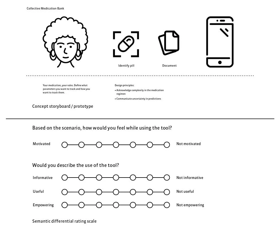
Synthesis of Findings
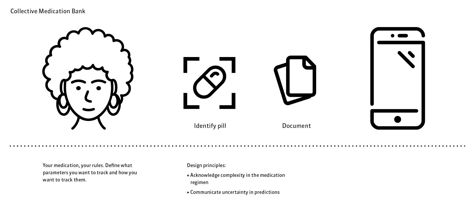
I then conducted the Rose-Bud-Thorn design method to synthesize the strengths, weaknesses and opportunities of each concept through a systemic ranking. This helped identify the most successful and least successful concepts through a holistic understanding of key factors leading to their success/failure. The concept that stood out to be the most successful was Collective Medication Data Bank.

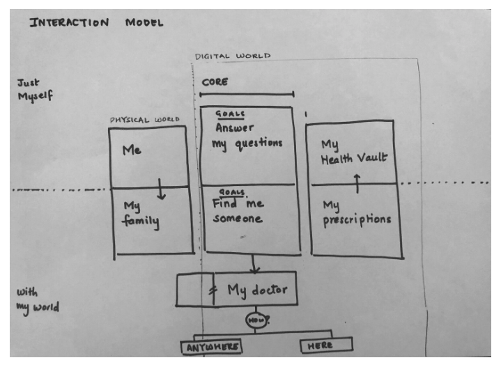
Conceptual Interaction Model
By sketching the conceptual model I began structuring a hypothetical experience based on how a user might manage their medications in the digital environment.
DESIGN
Information Architecture
I organized, structured and labeled content in a way that helps users find what they are looking for. This involved the creation of a logical and intuitive structure for information that makes it easy to understand and navigate. This helped me understand how users think and what they expect to find on the digital app. The goal was to create a seamless experience for users by making it easy to find the information they need. It involves designing the information hierarchy, labeling content, creating a navigation structure, and organizing information in a way that makes sense to users. This also involved the content strategy and the organization of the data.


User Flow
When preparing the user flow, it was important to keep it very simple since we wanted the user to stay within their goal of using the new tool. It was essential to maintain fluidity through the navigation. The product definition and architecture was broken down into epics for agile sprints. Through interviews with medication users each epic was broken down into stories with outlined features were added to make a logical flow of actions with the design team.
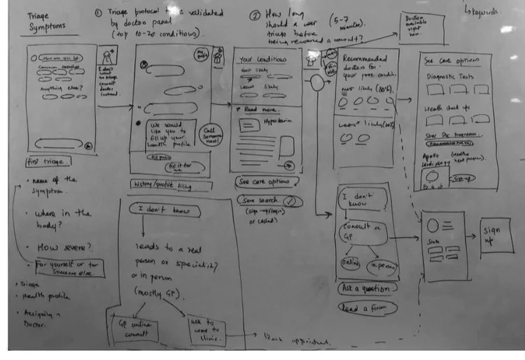

Initial concept for medical condition category that builds a decision tree and directs you to the right medication. An initial version of detailed feature suggestions for the journey that allows users to manage and select medication options.
Personalized Reminder
Smart Filter
Medication Data Bank
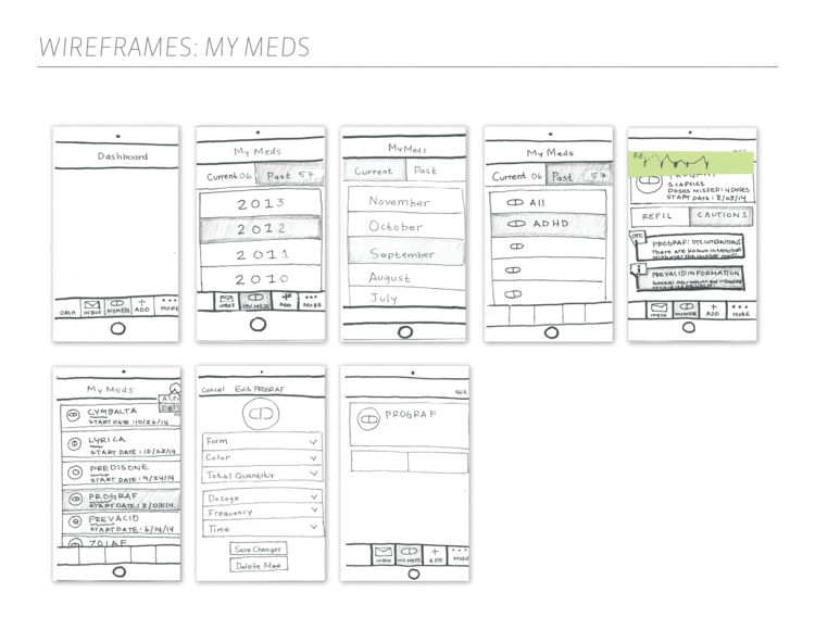
Wireframing
Visual Design System
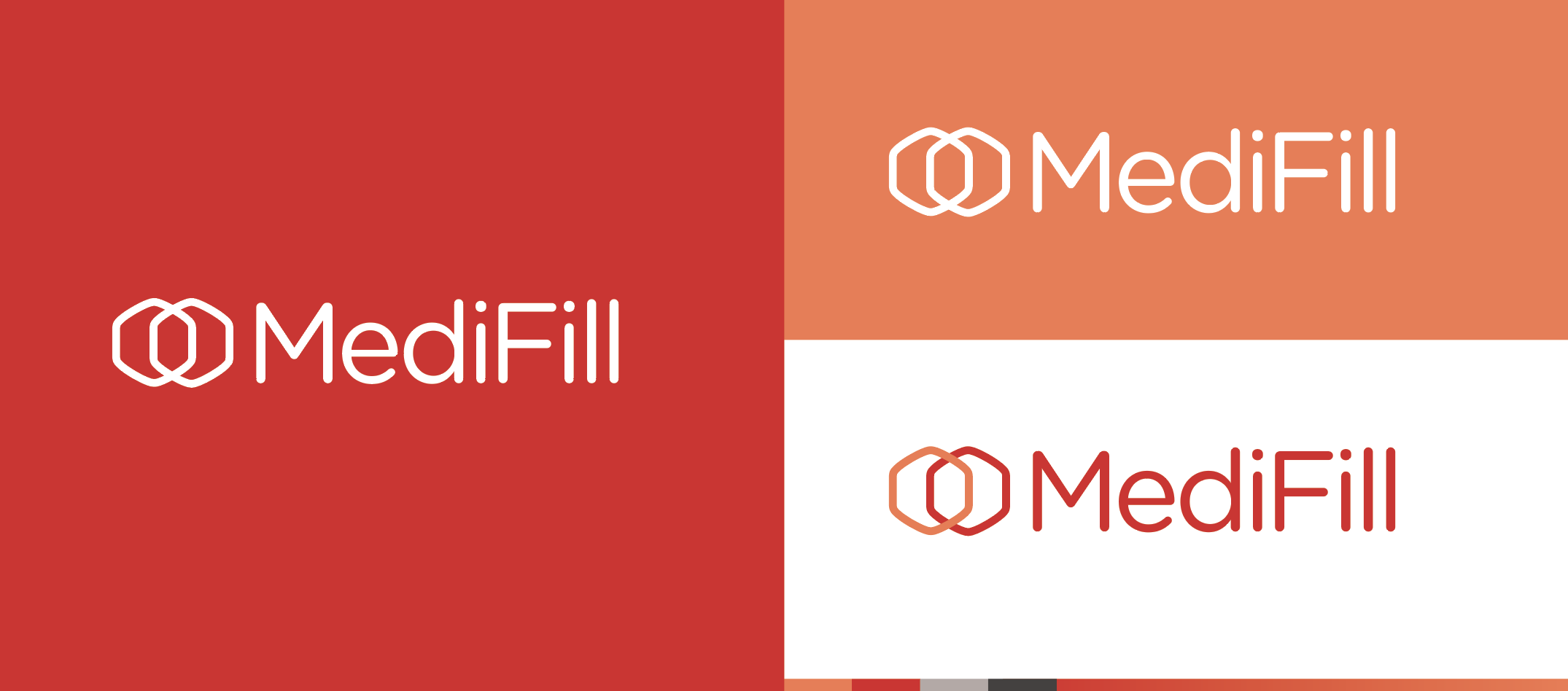
When managing the development of the brand identity, I facilitated an exploration of the company’s vision, goals, audience, personality, and unique strengths to visually differentiate the start-up from competitors within digital health sector. Throughout the creation process of this design system, I collaborated with the Design Strategist to bring the UI Kit to life for the self service mobile application. The impact of a successfully aligning key stakeholders throughout creative process built consensus for the launch.

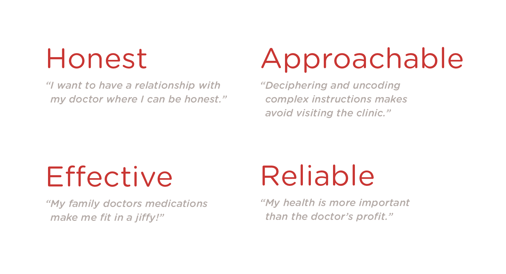
Brand Values
Based on quotes from our initial research, I defined brand values for the end-to-end health ecosystem, keeping in mind that the service touch points would be both physical and digital.
TESTING
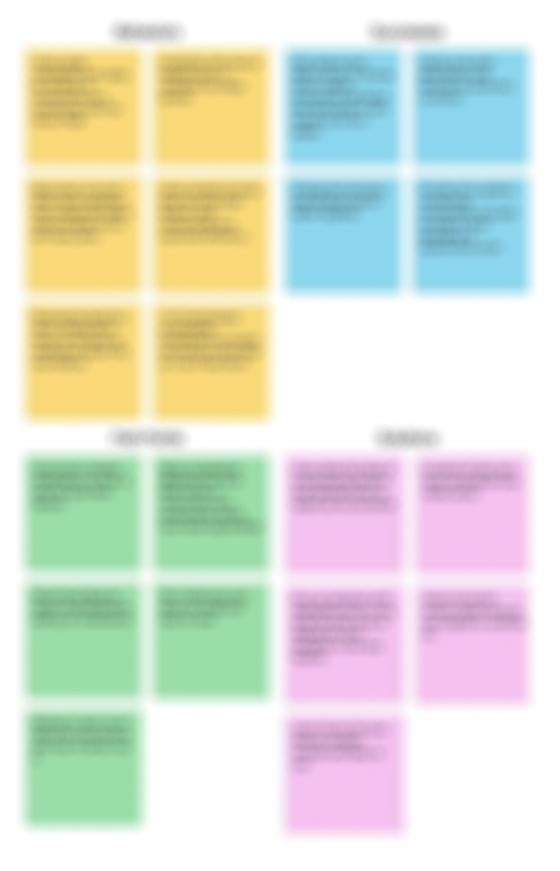
Affinity Diagram
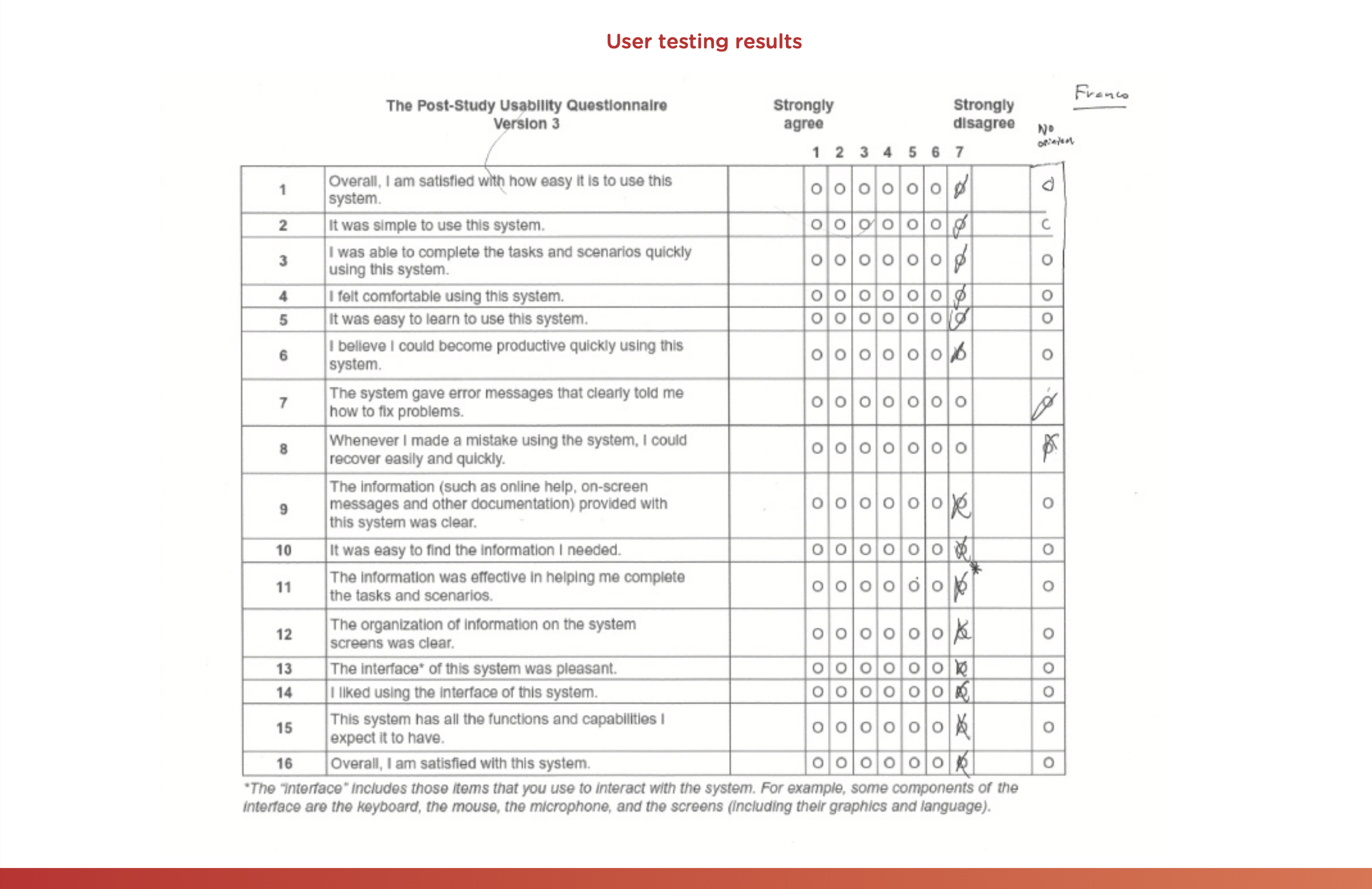
Usability testing was performed for the mid-fidelity design to rule out any preliminary pain points that could occur during the prototyping stages. Testing was done by observing participants perform live actions. Once testing was complete, results were placed within an Affinity Diagram to determine existing pain points, frustrations, improvements, and successes.


Solutions
Users liked the idea of a customizable medication condition category feature that directs them to the right medication and allowed them to efficiently manage and select medication options.
Users found a visual log of their data and suggestions based on emerging patterns helpful when tracking adverse reactions.
Behaviors
Users wanted to know how to connect with other medication users if they shared a similar experience to improve connectivity through a space to exchange stories and opinions.
Pain Points
Test inside pop-ups were too small and hard to read.
Successes
Enlarge text and pop-ups window size for better legibility.
ITERATION
Revisions
Necessary changes were made to the prototype so the user could better utilize and understand the new tracking tool. Additional tasks were added to the prototype developed based on participants’ feedback. Allowing the user to add; customizable medication condition category and a log of their data with suggestions based on emerging patterns to the desired Collective Medication Data Bank.
Defining Features


High Fidelity Designs
Unique screens and key user flows were designed in high fidelity to communicate the look and feel of the product before the hand off to front end development.


Prototype
With preliminary sketches in hand, we collaborate with the development counterparts to understand how our To-be-experience aligns with the product roadmap. As a group, we use a prioritization grid to understand what parts of the proposed experience have both high user value and technical feasibility. This helped to clarify what we can commit to for a given release.
LAUNCH
Reflections
Throughout the exploratory phase my aim was to gain a deeper understanding of the current state of medication adherence tools and identify their shortcomings by understanding the needs of medication users. The problems with current tracking tools that were identified led me to think that tracking can be improved by offering effective data visualizations to help users better identify potential adverse patterns.
Discovering the different possibilities proved very interesting and enlightening since I had to interview and retrieve information from users with complex conditions that helped target what areas needed more attention. I realized that the root cause of poor data visualizations was the lack of data itself and in order to provide relevant information to users of medication adherence tracker applications, it is necessary to have sufficient data. The feature development driving the Collective Medication Data Bank was innovative in it’s approach to crowd source medication data with a management tool by leveraging X technology/technical capabilities to drive faster insights and delivering comprehensive view of a personas data to improve their adherence. The motive was to advance research to debunk primary failings, including wrongly assessing drug interactions of medications and predicting inaccurate medication regimen.
Key Learnings
Greater understanding of how to apply data-driven technology suggestions and effectively contribute to discussions as part of a larger team within a research environment.
Keen interest in data-driven products and experiences deepened my passion in addressing challenging problems that people face with simple and delightful experiences.
Gather product requirements and collaborate with stakeholders to understand user stories as well as business objectives for design.
Create wireframes, designs, and prototypes using InVision to address user needs.
Conduct usability testing to understand an end user's ability to work through a flow and iterate based on feedback in order to provide the most intuitive experience.