Client
SES (Société Européenne des Satellites)
Scope
September 2014 - December 2014
Role
Graphic Design, Brand Identity and Logo Design, Design System, Platform Guidelines
Deliverables
Graphic Design, Identity System, Branding Guidelines, Magazine, Brochures, Campaign, Web Design
Team
Creative Director, Brand Strategist, Project Manager, Senior Designer, Graphic Designer
Created the e-mobility brochure with a concise illustration style for the Volkswagen brand inspired by “Think Blue” Eco-campaign – autonomous driving combined with new mobility solutions expected to mark Volkswagen's transformation into a leading provider of sustainable mobility. The illustration style is strategically linked to the brand principles and at the same time is adaptable to the most diverse requirements. Complex themes and a wide range of stories can therefore be told in a modular and individual way to connect with the target audience.
To develop the illustration style, we examined the character of the brand, the tonality and its positioning. Furthermore, we examined the individual brand codes - i.e. design elements of “Think Blue” Eco-campaign such as color, font, design language and the brand structures headlines and texts. All these parameters translated into the starting point for the original and eye-catching visual narratives that communicate through the application of data visualizations to present complex information in a clear and engaging manner.
OVERVIEW
Background
SES prides itself for being the world’s leading content connectivity provider. Together with their industry partners, they aim to do the extraordinary in space to deliver amazing experiences on earth. SES is focusing on worldwide growth and a globally unified brand. MetaDesign worked with the satellite provider to develop a completely new look in only three months – one that carried the company into the future and won the Corporate Design Award and the Rebrand award.

Design Problem
SES restructured and the company needed to streamline the organization's activities under a single management team and one main brand (SES), incorporating the company's two previous operating entities, SES Astra and SES World Skies.
The Value of a Design System
Our goal was the implementation of a scalable system that unifies the company's two previous operating entities, SES Astra and SES World Skies with the development os one main brand model (SES). Setting forth a critical roadmap to future business success with a common understanding of the new identity within the company and inside the minds of the company’s customers.
PROCESS
A Systematic Approach
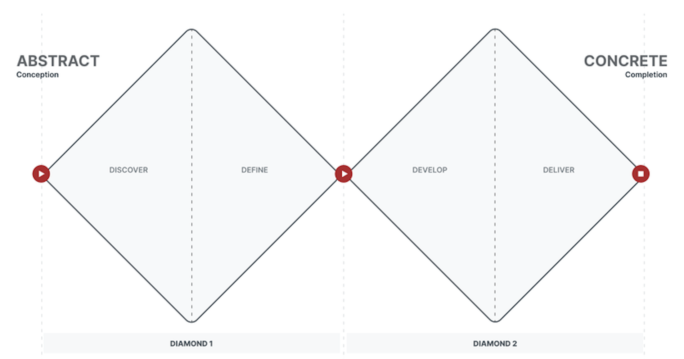
We used a systematic design framework called the Double Diamond method to inform the design and development of the new Corporate Design for SES.
Diamond 1: Discover & Define
The first diamond involves an analysis in the form of auditing and assessing the scope of work to identify and categorize existing corporate assets of the company led by the Brand Strategist. The sections discover and define included brand strategy, brand positioning, its core and extended identity elements as well as brand architecture. Additionally, an insight into the corporate design, core messaging and tone of voice.
Diamond 2: Develop & Deliver
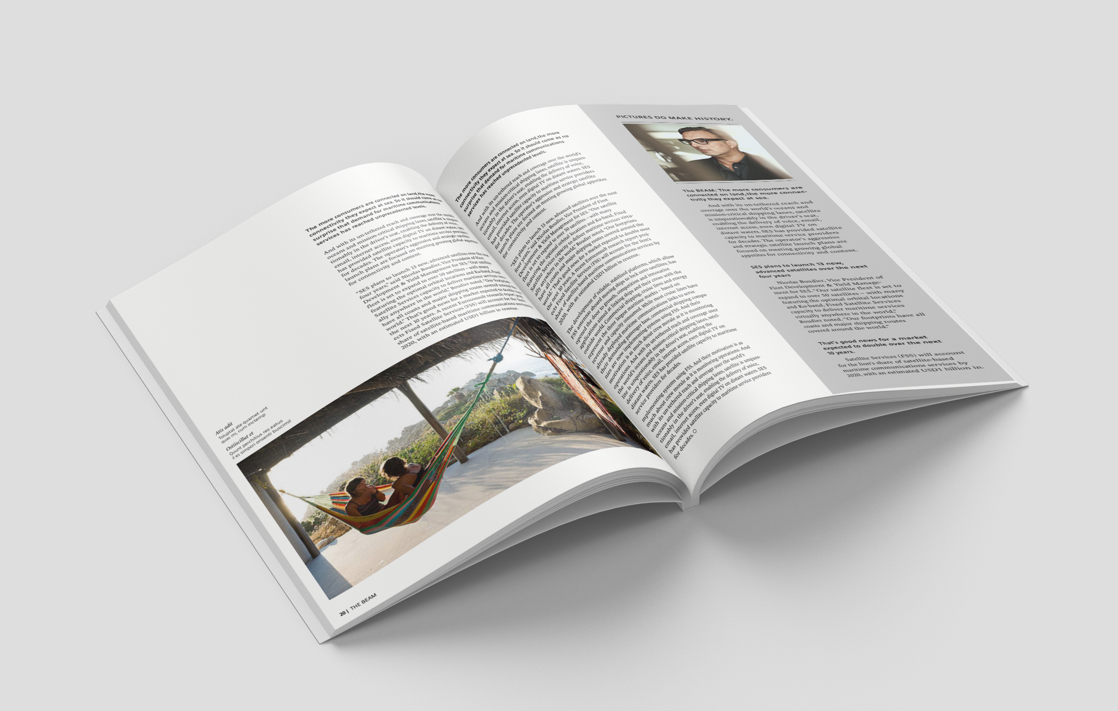
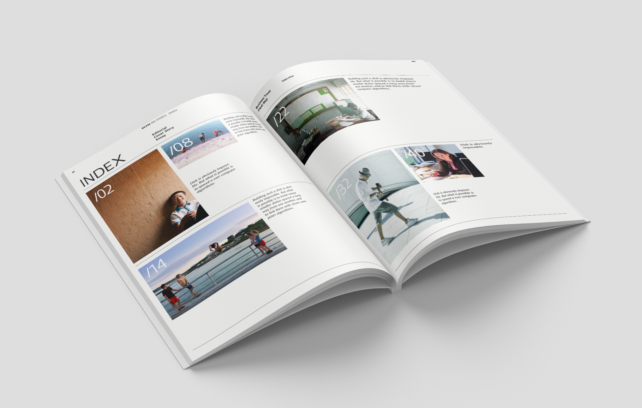
The second diamond involved brand building with the creation of basic elements; logo, typeface, colors, design principle, imagery, graphics led by the Creative Director. The sections develop and deliver focus on brand experience via brochures, magazines and advertisements. Brand manual with guidelines provides an explanation with examples on how to apply new design principle to different types of collateral, as well as guidance on the use of design elements for applications.
BUILDING
Redesigned Brand Identity
Our primary objective when establishing a new brand identity was the interplay of the design language with distinguished basic elements to ensure distinction in the industry while conveying stability and continuity to customers and employees alike. The basic elements unite three very different brands and cultures and act as an anchor.

SES previous brand identity
SES new brand identity
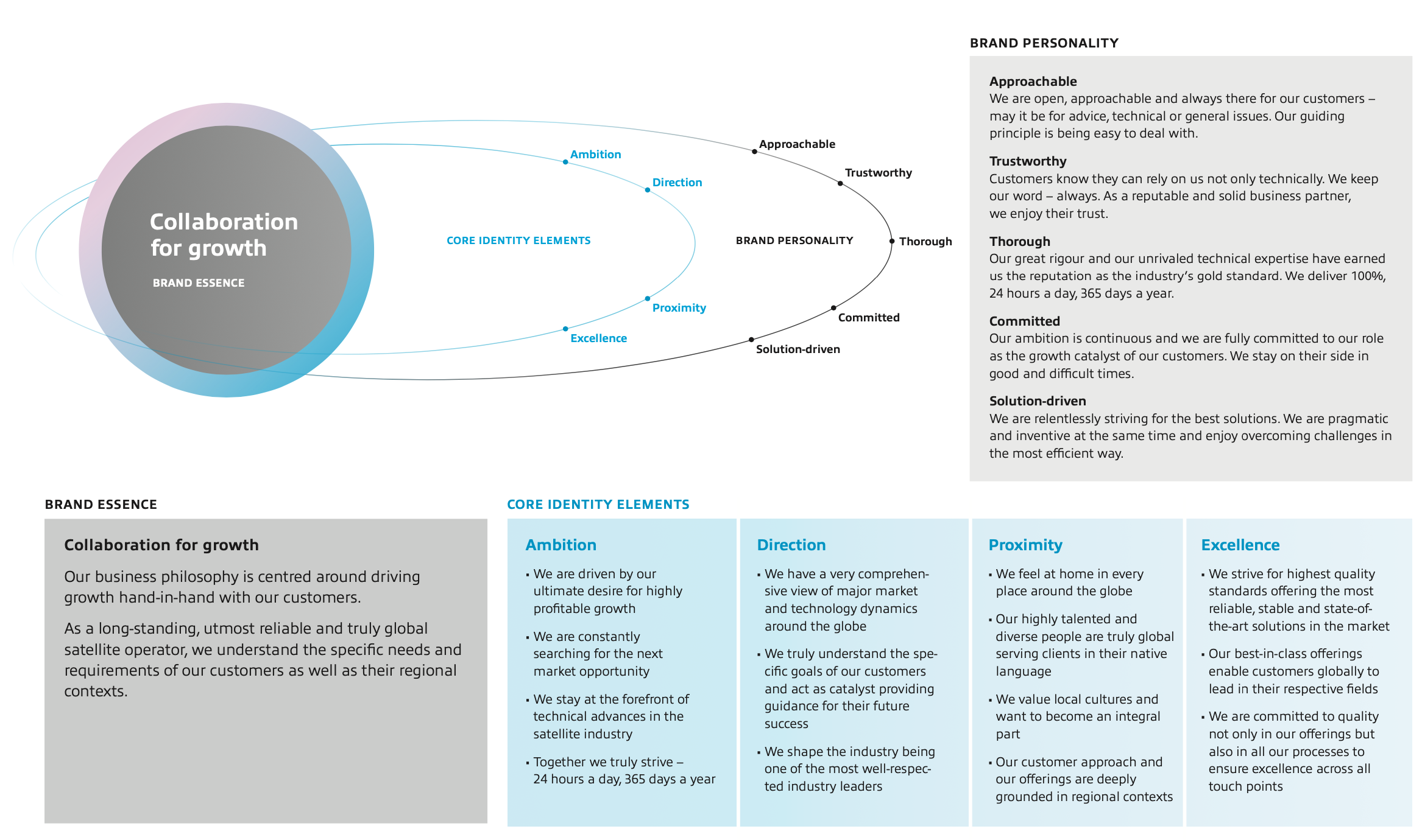
Core Identity & Brand Strategy
The brand model offers a comprehensive overview of “who” a brand is. It shows how the constituent components relate to one another. The model shows the SES brand as an organic, integrated whole that consists of the brand essence, core identity elements and brand personality.
Brand Architecture & Master Brand
The business decision to align all divisions of the SES organization under a single management structure necessitated the creation of a powerful SES master brand on a global scale. The SES master brand is instrumental in achieving improved clarity and consistency of offerings towards different customer segments and their specific needs. While optimally serving existing segments and future growth areas, it is designed to leverage synergies between different offerings.

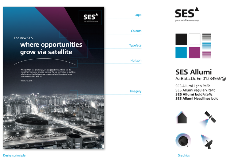
Basic Elements
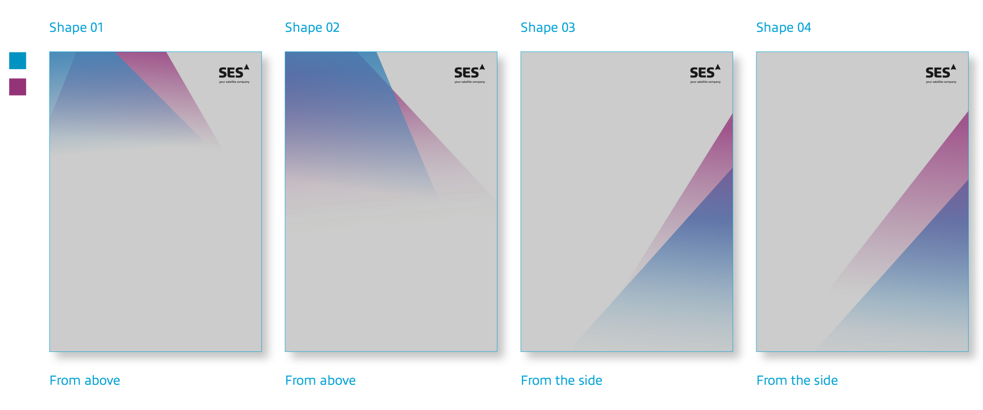
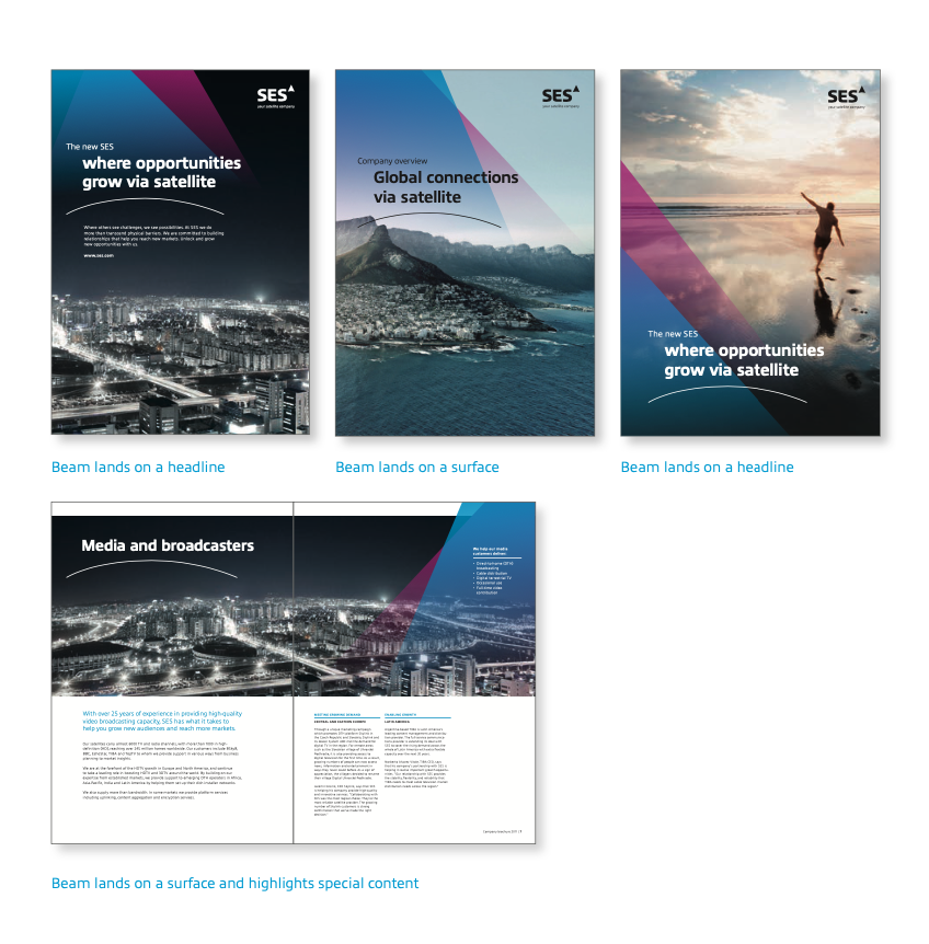
The brand’s key visual element is the beam. Its shape is derived from the logo. The beam is rooted in the SES brand identity and conveys ambition, proximity, direction and excellence. It shows the way forward and moves beyond borders.
It was critical to develop a design principle for the basic elements to effectively communicate desired messaging of the beam’s capacity to transforms everything it touches, thus revealing the positive impact of SES. I contributed in producing the derivation of the beam, defined in a beam shape with two layers (SES Blue and SES Magenta) for web applications, covers and collateral pages. The principle offered a holistic view of the language’s fundamental elements, supporting teams in creating common digital and physical layouts and reusable elements.
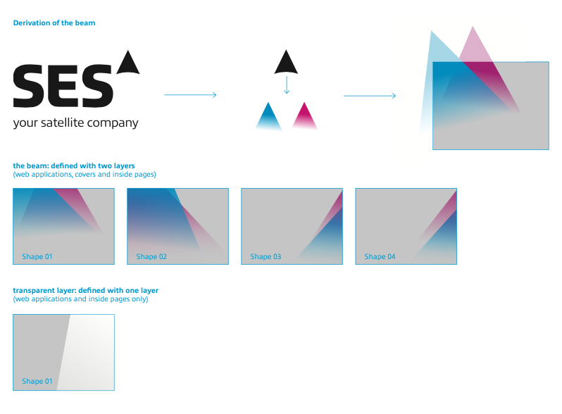
In this process I contributed to testing functionality to make sure the basic elements worked as expected, designed with best practices and accessibility in mind. This process resulted in a detailed ruleset of the brand‘s basic visual elements and how to use them to create different applications across different media in accordance with the new design.

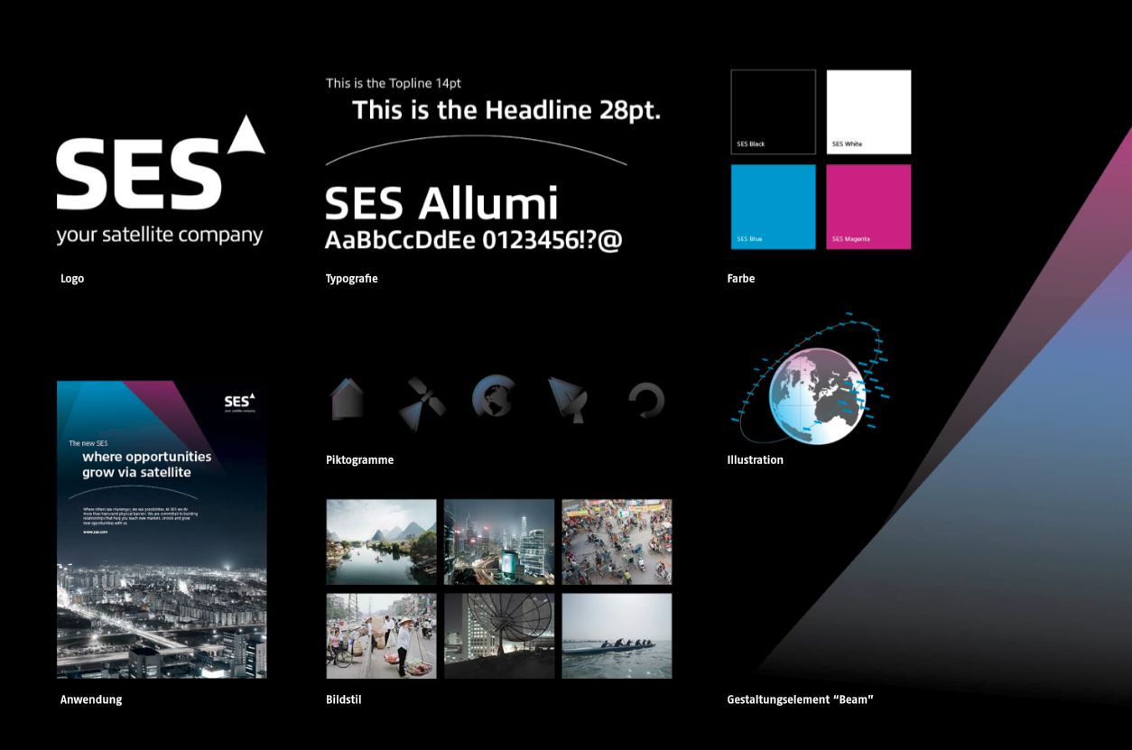
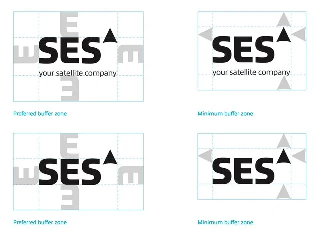
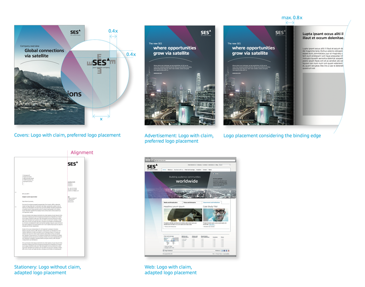
Logo Properties
The symbol (the beam) unifies SES into one strong umbrella brand. The beam is elevated and resembles a trademark; it expresses superiority and signals leadership.
The word mark is a typographic signature that creates a harmonious overall image and has been specially designed and optimized for SES. The typography conveys commitment and approachability, and combines technology with a human touch, as seen in the contrast of sharp and rounded edges in all letters. It communicates the aim of combining customer focus and technology.
The claim expresses the SES claim to leadership: to be the major global player in the industry.
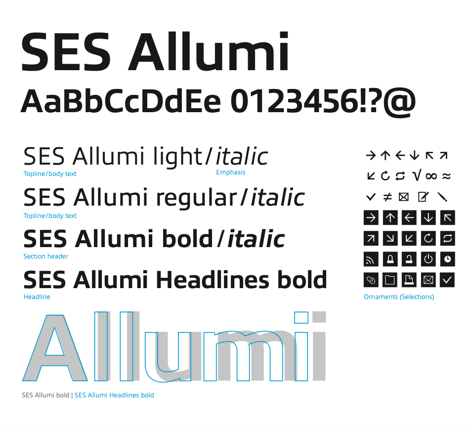
Typeface
SES Allumi, is the new corporate typeface, SES Allumi is a sleek typeface designed with technology in mind. The SES Allumi shapes are neither perfectly round nor geometrically square. It’s a human design with a high tech touch.
Color
SES Black and White project excellence and simplicity. Both colors are used for the logo and typography. SES Blue and SES Magenta are the brand’s guiding colors; they are the energy behind the beam. They are also used for illustrations and graphics. Within the corporate design context, the various colors perform various tasks. The manner in which they interact imparts all applications with a consistent, unmistakable identity.
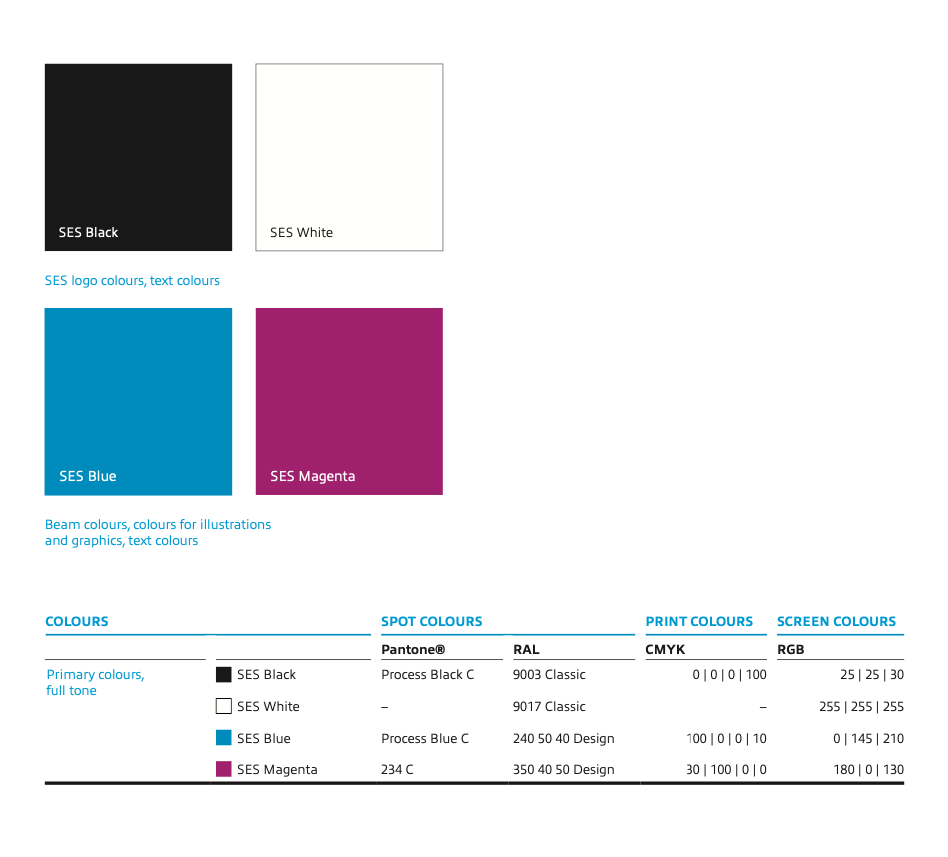
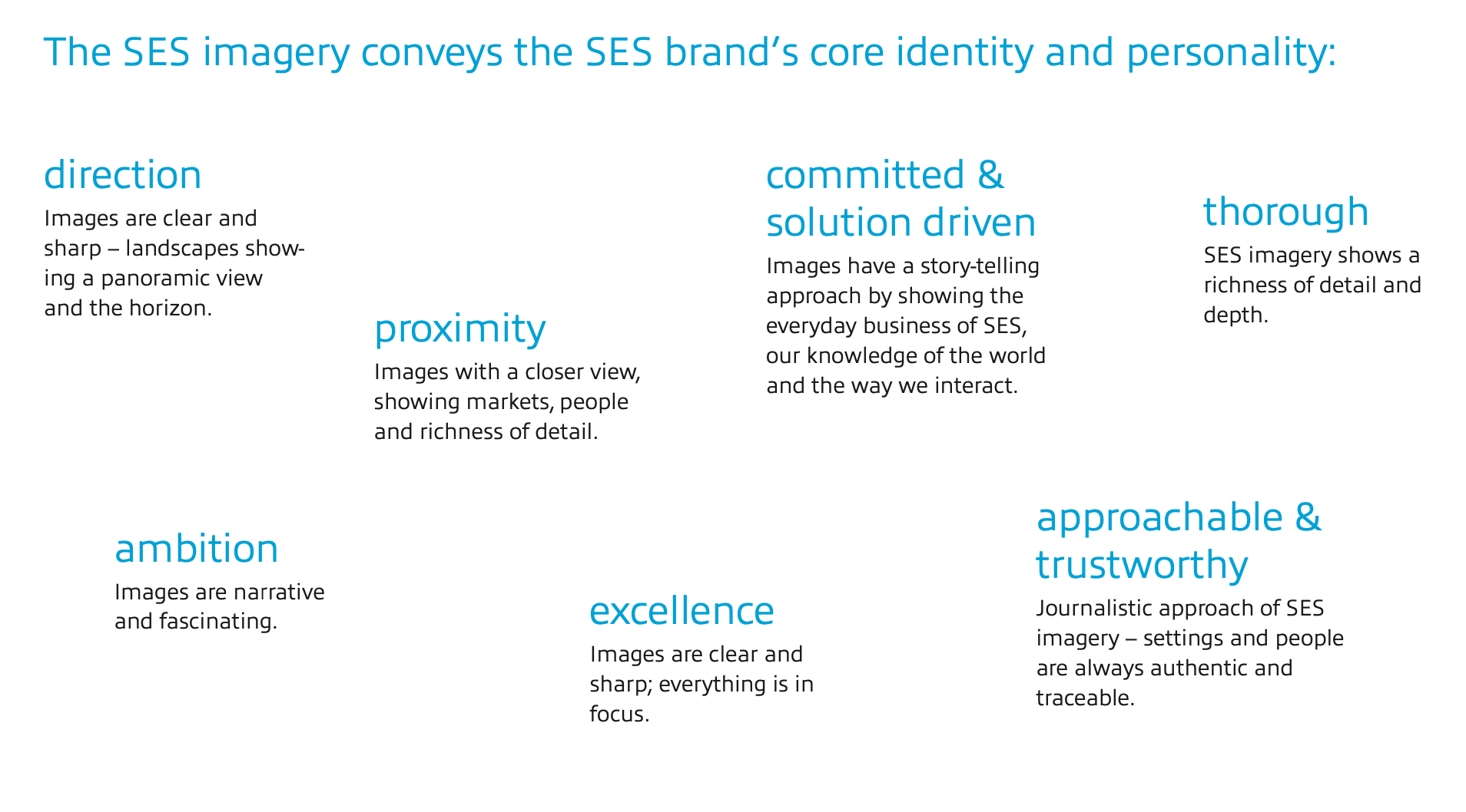
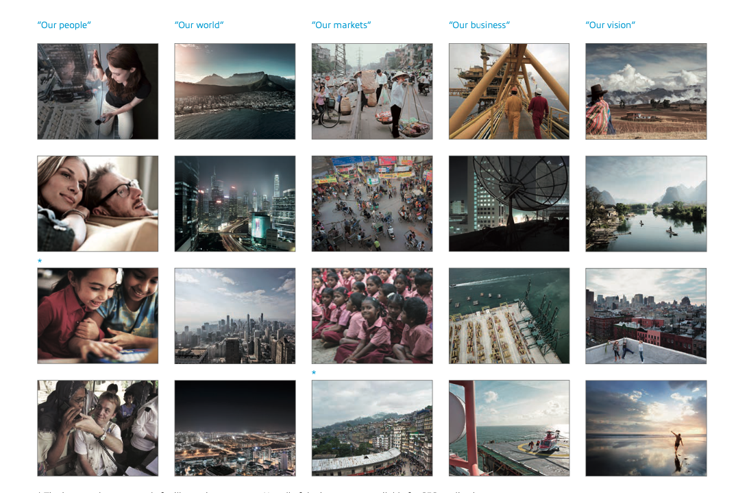
Image Attributes
Images help to create an emotional identification with the brand and to distinguish the brand from its com- petitors. They have to display a consistent overall picture in all sections of the brand. Therefore, the imagery needs to transmit the brand’s personality visually (”committed & solution driven – approachable & trustworthy – thorough“) while supporting the company’s reliability and serious approach.
Concept ”Beyond borders“: Overview

Graphics
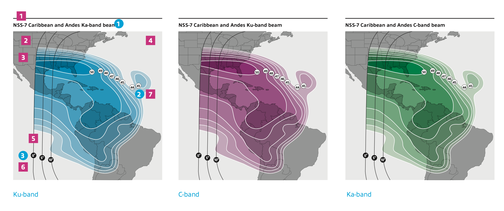
When designing a fresh illustration and icon style the aim was to make SES technology clear and understandable. I played a key role in determining how the graphics were to be divided into six categories: pictograms, technical drawings, fleet and teleport maps, illustrations, footprints and information graphics. This impacted how every category displayed the SES brand, ultimately making the new corporate design distinct and unique.

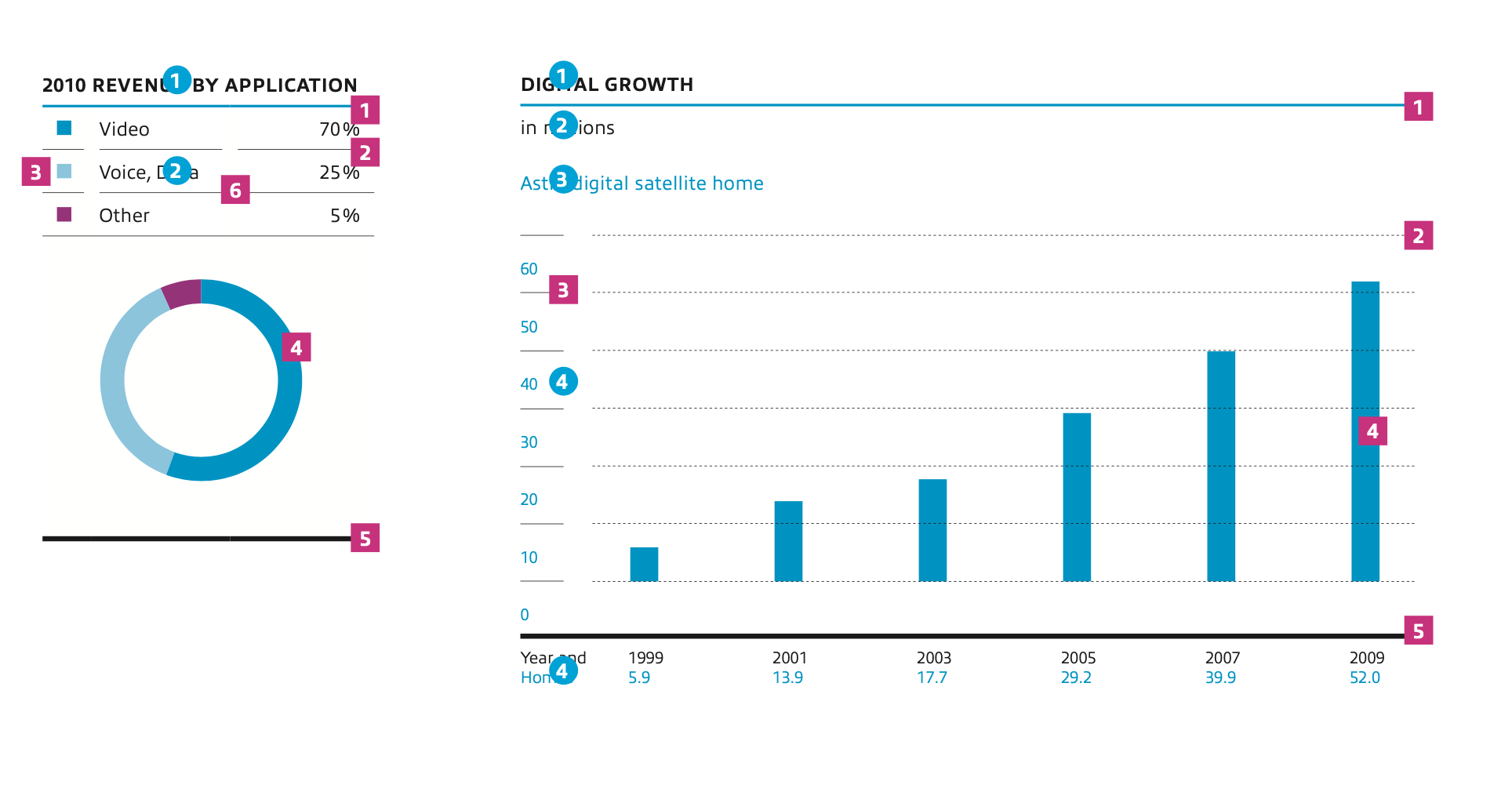
I contributed in developing the variations of information charts and worked on enabling the presentation of factual data, comparisons of values and illustrations of long-term developments. This provided a newfound perspective in how data visualizations are powerful in their ability to transform data into insight. I acquired a keen eye for representation of complex concepts through the practice of information graphics.

DOCUMENTATION
Guidelines
A set of guidelines were established as part of the collective principles that would govern the new system. The components that I played a contributing role in varied in complexity, as I took part in efforts to carry out the branding platform manual to solidify an informed understanding of any implementation of the new SES corporate design was done so properly. This had a strong effect in creating consistency in communicating the company, affiliate companies and products to internal and external audiences.
LAUNCH
Reflections
SES’s redesigned design system achieved remarkable success, presenting both challenges and moments of fulfillment. The rebranding had rolled out before the set deadline and efforts on educating SES internally on proper usage was critical. My contributions to the development of SES brand platform guidelines helped bring understanding when implementing the new SES corporate design properly and was made known by MetaDesign leadership, highlighting the value of collaboration and efficient communication to ensure comprehension. This extensive cross-collaboration between brand strategy team, design system team and executive members within the company emphasized how critical it was for all parties involved to have a sense of diligence and efficiency when sharing information. I found joy in every aspect of the project's early stages, playing a role in shaping creative processes, contributing to the building of the brand‘s basic elements, developing the variations of graphics with information charts and forming bonds with colleagues across teams was immensely rewarding.
Key Learnings
Developing design systems and implementing accompanying guidelines was a deeply informative experience with gained knowledge of branding methods and best practices. Demonstration of ability to interpret and implement brand guidelines consistently.
Leveraging brand strategy including the application of SES beam design principles through the Design System’s basic element creation, differentiating SES clearly from its competitors and establishing a strong profile in the market.
Building the SES brand platform with knowledge of basic visual styles and aesthetics including, color, typography, grid systems, and hierarchy solidified a comprehensive understanding of how to apply new design principle to different types of print and digital collateral properly. Reflecting the brand strategy, contributing to a strong, and coherent brand appearance across different media.